Wednesday, 6 December 2017

Professional Pre-Production: Branding & Marketing Version 5

As Pleasure Park has been developing, there has been one issue that has remained: the branding looks too animated. To rectify this I have rebranding the show to create version 5 of the branding & marketing mock ups.

BRANDING & MARKETING VERSION 5

These are the problems I identified with the previous versions, which I feel contribute to it looking animated:

- The blue sky doesn't look real as it is just on plain colour.
- The ground doesn't look real, it should be a texture.
- The rollercoaster needs to be a different colour so it looks more like a silhouette.
- The clouds used on the poster look too cartoony, they need to be replaced with a realistic textured cloud.
- Although the folded corner adds to the warped poster effect, it still doesn't work in the grand scheme of things.

I still want the logo to look like it is in the sky above the amusement park, but I want it too look more realistic.

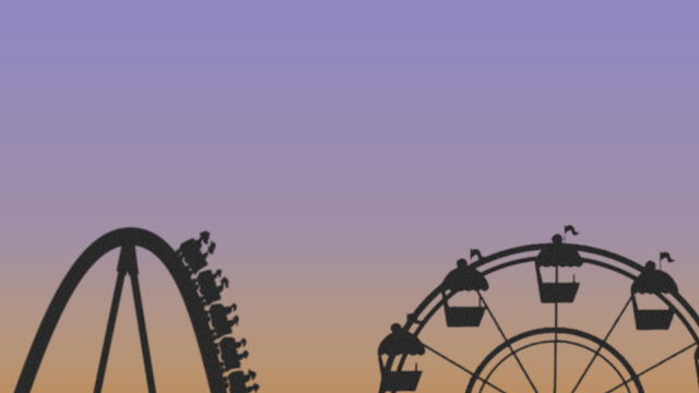
I started the process of creating a new title card with the background, which is still a colour, but a gradient like the real sky. It starts quite green/yellow, and ends quite blue. This combination of the two colours looks like the sky when the sun is setting. This gradient, with all the additional elements in the next stages, also looks more realistic than the original sky colour in the previous versions.


Next I added the silhouettes of two amusement park rides, a coaster, and a ferris wheel. I did this so it is clear we are in the sky above the amusement park. They are silhouettes because I plan to add a sun that is shining at what would be the camera, so this was cause the rides to look dark and in silhouette.


After this I added a layer of clouds, both in front of and behind the rides. These clouds are more realistic than the ones in previous versions. I also made the clouds quite grey, to add to the dark and run down look the branding needs to have. It gives the idea that the park is surrounded by grey clouds. As well as this, I added a sun setting in the corner of the screen.


I then added the logo of the show, which has not changed, to the centre of the image. I placed a slight layer of clouds over it at the bottom of the screen to give the image a slight 3D effect, as though the logo is hiding in the clouds above the park.


Finally, I added an inner shadow, grunge texture, and a faded overlay. This, when combined, made the image look old and run down, like the fiction amusement park the show is about.

This is the final version:


I am very happy with the new branding. I feel it looks more real than the previous versions which looked too animated. I also feel this new branding fits the show better than any previous versions. When you look at this version, you don't instantly assume the show is an animation/cartoon.

Using all of the elements of the new branding, I have also created new promotional material: poster, billboard, bus poster, etc...

All of the new promotional material follows the same layouts as the previous material, but with the new elements from the new branding.

Poster

Billboard

Bus Poster

Bus Stop Poster

Small Billboard

I feel all of the new branding & promotional material fits the themes and style of the show a lot better than any previous versions. This will now be the final version.

Professional Pre-Production: Costume Design

As I am focusing on the visual side of the pre-production process, costume design is something I need to consider.

COSTUME DESIGN

My characters work in an amusement park, so pretty much 100% of the time they will be in their work uniform. Because of this I have only focused on coming up with a design for their uniforms, and no other costumes, as they will be in their uniforms throughout the whole series.

To help fuel my own ideas for costume design I looked at the work uniforms of two major UK theme parks: Alton Towers & Chessington WOA.

Their work uniforms look like this:

Alton Towers
Chessington WOA
It would appear that as the two theme parks are owned by the same company, they wear similar uniforms. Their uniform consists of black trousers and shoes, mixed with a polo t-shirt, and a zipped fleece. The polo and fleece are the colours of the park's logos. As well as this information, I also known from working in an amusement park myself, that a t-shirt/fleece combination is a common uniform during the summer period at a theme park.

Using this research I have decided that my characters will wear red polo t-shirts, which occasionally will be combined with a red fleece/jacket/hoodie. The red colour fits with the colour scheme of Pleasure Park's logo. As well as this, the characters will wear a blue name badge which has the logo on it.

I used Photoshop to mock up these images of what the costume design will look like:

POLO T-SHIRTS

FLEECE/JACKET/HOODIES

I feel this costume design, along with the name badges, fits with the show, the characters, and the uniforms of other major theme parks. If for any reason a character needs to be in a scene without their uniform, their costume design will be based on their characters personality.

Tuesday, 5 December 2017

Professional Pre-Production: Branding/Marketing Version 3 & 4

During my tutorials its was mentioned that my branding & marketing mockups still looked too animated. I took this feedback on board to work on version 3.

BRANDING & MARKETING VERSION 3

To develop the branding:
- I changed the earth in the logo from the animated one to a more realistic looking one.
- I added a pattern texture to the rollercoaster, and to the text in the logo, again to make it look more real, and less animated.
- I added a metal texture to the space behind the text in the logo to make it look more like a sign, as the logo is the sign outside the amusement park.
- I added a crinkled paper texture to the background to add to the idea that the title card is a old poster for the park that is peeling off of a wall.

After making these changes, this is what the new graphics looked like:

Title Card


Poster

Billboard

Bus Poster

After these developments, something still wasn't right, so I worked on a 4th version.

BRANDING & MARKETING VERSION 4

To develop the branding:
- Added a metal texture to the entire image to make it look at real as possible, and therefore not as animated.

After making these changes, this is what version 4 of the graphics looked like:

Title Card

Poster

Billboard

Bus Poster

I like version 4, and I feel it looks less animated than the original. I will continue to develop the branding and marketing as this project moves forward.

Professional Pre-Production: Style (Visual/Editing)

One part of my role on this project is working out what kind of style Pleasure Park will have, in terms of visuals and editing. This will be an important part of the process, as it will help with the decisions on every other visual element of the show.

STYLE: VISUALS

When referring to visual style, you are not referring to what you shoot, but instead how you shoot it, and that's what makes it your style. Pleasure Park will attempt to have it's own unique style, but one that still follows the conventions of the genre it exists in.

There are a few different elements of Pleasure Park's style that must be explained:

The first element of it's style are the themes it represents through the lens. These themes are dark humour, light humour, urban/rundown themes, and failure. These themes will be represent not only by the dialogue and characters, but also by the visuals in each episode.

The second element is framing. Pleasure Park will follow the example of most other television programmes by using a range of frame sizes to tell the story. These can include wide shots, mid shots, and close ups. These types of shots also fit in with the styles of my Director and DOP, and assumption I can make based on their previous work.

The next element is the types of angles or shot types that might be used. Pleasure Park will use a range of establishing shots before each scene, and these shots will mostly be from a high angle above the park to show it's full scale, and how empty it is most of the time. These establishing shots will also help the viewers understand the location and the geography of each scene. This is also a common technique used in Benidorm on ITV, which was directed by my chosen director. As well as this, other common shots like high/low angles, shots with a shallow depth of field, shots with movement like jib shots, or dolly shots, maybe also be used as part of the shows style when applicable.

example of an establishing shot in Benidorm (ITV)
The final element of style is lighting. Pleasure Park will almost entirely be designed to look as natural as possible, as to add to the realism of the location, characters, and storylines. This will be achieved by using natural light, and a blend of daylight balanced lights which build up the light in a scene when needed. As well as this, the lights on the rides will play an important part in every exterior scene, as in real amusement parks, they tend to be a big source of light across and entire park.

Overall, although Pleasure Park is not a mockumentary, it will still follows some of the same conventions as that genre, in terms of shot composition and style. I would describe the style as distant and handheld, with the occasional tripod, jib, and dolly shots thrown in when needed, as well as even some steadicam shots for longer scenes within the park. My reason for choosing to make the cameras distant at times, is because I want to the audience to feel like they are a customer in the park witnessing these weird and wonderful events take place.

STYLE: EDITING

Pleasure Park will be edited mainly by my chosen editor Nick Ames. The editing style of Pleasure Park has been chosen based on his experience and style, and on the style that best fits the themes and style that the show and aims to represent.

There are a few different elements of Pleasure Park's editing style that must be explained:

The first element is the types of editing techniques that will be used. Pleasure Park will used three different types, continuity editing, sequencing and cutaways (which sometimes may be built up using a sequence). Continuity editing will be used to build up every scene in an episode; cutting the shots together in order to create a scene that flows and make sense. Sequences will be used to blend different establishing shots between scenes (see Benidorm example). And finally, cutaways will be used to sometimes show a past scene that a character may refer too (see Family Guy example), which is different to how cutaways are normally used, when the cutaway is occurring at the same time. These are cutaways to past events, like flashbacks.

Establishing shot sequences in Benidorm. 
Taken from an episode directed by David Sant, and edited by Nick Ames.

Cutaway example from Family Guy


The next element is the types of cuts used. After carrying out some research I found that a common type of cut used in television is called a J cut, which is when the audio from the next scene begins to play on screen before the it is actually cut to visually. Another extremely common type of cut is the hard cut, which is used all the time, and is just the technique of cutting back and forth between two or more shots. And the final common type of cut is to cut on action, which can help to smooth out a cut. All three of these cutting types will be used in Pleasure Park.

And the final element is colour grading. Pleasure Park will attempt to look as natural as possible, and so the only colour grading carried out will use colours already in the scene and just enhance them. This will be in an attempt to not make the show look to filmic or dramatic, and instead keep the natural look, that will also be achieved through lighting techniques.

Friday, 24 November 2017

Professional Pre-Production: Genre Change: Mockumentary to Comedy

Whilst working on certain elements of the show, I have decided that the mockumentary genre is not the right fit.

GENRE CHANGE: MOCKUMENTARY TO COMEDY

What is Comedy (in reference to television)?


According to the Oxford English Dictionary, comedy is 'professional entertainment consisting of jokes and sketches, intended to make an audience laugh'. In terms of genre, it's defined as the 'style or genre represented by comedy films, plays, and broadcast programmes'. So basically the jist of it is that whatever you claim is a comedy, must be funny and entertaining. I believe Pleasure Park fits into this category as it is a humourous take on the world of the amusement park.

Comedy, like most things, originates from Ancient Greece. It was originally used as a term to describe stage plays that had happy endings. Aristotle himself once said that comedy is an imitation of men worse than average. To this day it is still true that your typical comedy characters are not like your average man or woman, and it's often this difference that makes them humourous.

It has also been said that the early Greek comedy plays influenced what we now call satire, which is different to comedy. Pleasure Park can also been seen as a form of satire as it is using humour to exaggerate the world of amusement parks, by criticising the types of characters you might find in that type of workplace.

In terms of television, comedy has always played a part. Television is a form of entertainment, and comedy is entertaining, hence why it's always been present. Over the year different types of comedy programme have come about like comedy drama (or dramedy), comedy romance (or rom-com), and even zombie comedy romance (or zom-rom-com). As well as this, my original choice of genre, mockumentary, came about as a branch of the comedy genre.


Why Comedy Instead of Mockumentary?

- The direction I wanted the show to go in fits better with the comedy genre than it does with the mockumentary genre.
- I feel the mockumentary genre limited what I could do with the show, how I could style it, how I could brand it, and who I could cast in it.
- By changing to a generic comedy programme, I can keep a majority of the cast members I originally wanted. I can also now keep the style of branding I wanted.
- Overall I feel the show will work better as a normal comedy, than as a mockumentary.

Sky One champion their original comedy productions, and so a comedy like this will fit into their schedule nicely, better than a mockumentary would.

Similar comedy programmes

Other similar comedy programmes have been produced in the past, these are:

- The Office UK/US
- Trollied
- Modern Family
- Benidorm
- The Inbetweeners
- And in terms of film, Adventureland

I will carry out contextual research on these programmes to help aide the continued development of Pleasure Park.

Professional Pre-Production: Cast Developments

Initial feedback on my casting was that my choices were not right for the type of show I was creating. In response to this feedback, and after my reduction in character numbers, I have recast the show. I also plan to change the genre of the show so I can keep some of my original cast members, amongst other reasons.

CAST DEVELOPMENTS

Frank 'Mr Pleasure' Diamond: John Challis

Known for:

- Only Fools & Horses
- The Green Green Grass
- Benidorm


Chosen to play this character because he has played similar businessman roles in the past in other comedy programmes. Fits the look of the character.


Agent: https://mn2s.com/booking-agency/talent-roster/john-challis/ 


Debbie 'Mrs Pleasure' Diamond: Josie Kidd

Known for:

- Bounty Hunter
- The Crown
- Call The Midwife


Chosen to play this character because she has appeared in sky comedies before, and fits the look and age of the character.


Agent: http://www.sainou.com/josie-kidd/


Ned Parker: Simon Bird

Known for:

- The Inbertweeners
- Friday Night Dinner


Chosen to play this character because he has played a similar underdog, dorky character in other comedy programmes.


Agent: http://www.theartistspartnership.co.uk/bird/806/


Jimmy (Jim/James) Reynolds: Clive Rowe

Known for:

- Tracey Beaker
- Doctor Who
- So Awkward


Chosen because he is not too well known, and he fits the look and age of the character.


Agent: http://www.unitedagents.co.uk/clive-rowe


Daniel Waterhouse: Tom Rosenthal

Known for:

- Friday Night Dinner
- Plebs


Chosen because he has played similar socially awkward characters in other comedy programmes.


Agent: http://www.unitedagents.co.uk/tom-rosenthal


Emily Roberts: Nikki Runeckles

Known for:

- Bad Eduction


Chosen because she is not too well known, and in the one show she is known for, she played a similar character.


Agent: Unknown


Katie Smith: Jessica Knappett

Known for:

- Drifters
- How Not To Live Your Life


Chosen because she is not too well known, and fits the look and age of the character.


Agent: http://www.unitedagents.co.uk/jessica-knappett


Jake Evans: Ryan Sampson

Known for:

- Plebs
- After You've Gone


Chosen because he is not too well known, and fits the age and look of the character.


Agent: http://www.unitedagents.co.uk/ryan-sampson


Harry Clarke: Jonathan Sayer

Known for:

- The Play That Goes Wrong
- Peter Pan Goes Wrong


Chosen because he fits the character, but also because he is a theatre actor, probably looking for his first break into television.


Agent: http://www.unitedagents.co.uk/jonathan-sayer


'Reggie': Marek Larwood

Known for:

- Sorry, I've Got No Head
- Celebability


Chosen because he is not well known and he fits the look and age of the character.


Agent: http://www.mareklarwood.com/contact-agent


Alfie & Zoe: Alfie Deyes & Zoe Sugg

Known for:

- Being popular vloggers on YouTube


Chosen because their role in the story required them to be famous British online stars, which they are.


Agent: https://www.gleamfutures.com/ 


These people will probably be my final cast for Pleasure Park. I feel they all fit the characters they have been chosen to play quite well, and I can see them being in the show, and in real life being up for taking part.

Tuesday, 14 November 2017

Professional Pre-Production: Character Developments

Following on from my greenlight pitch feedback, I have updated the character profiles for Pleasure Park.

CHARACTER DEVELOPMENTS

The heaviest bit of feedback I received about my characters was that the female characters didn't seem to have good purpose. They all fancied men, or relied on men. This was not my intention, and I didn't even realise that was the case until it was brought to my attention. I wanted to ensure this was no longer the case, and so I have re-written all of my female characters.

As well as this I have re-written small details about each of the other characters. These are the changes I have made:

- It has been made more clear that Frank is determined to keep the park open, and he will do anything for the park.
- Ned now has a love of theme parks which he is not afraid to show. He knows everything there is to know about theme parks. I've added this detail, one because it fits with the real life person this character is based on, but also because it gives other characters something to be irritated about.
- Jimmy is now an old friend of Fransk. They met during the time at Pleasure Park that Jimmy calls 'the good old days'.
- Daniel is also socially awkward. This helps you as the audience understand more why he struggles to fit in at first.
- Emily is now a much tougher character. The rumours about her have been scrapped from the storyline and she now has a bit of a dirty mind, something which further attracts Daniel.
- To help reduce my character numbers I have also cut the following characters: Sara Green, Sophie Smith, Oscar Wood, Lucy Taylor, & Freddie White. I have cut these characters as I feel they did not add anything to the storyline of the first series, however they could appear in future series if the show developed.
- Finally, using a good idea from my tutor, the 'professional' filmmakers are now two YouTube celebrities who will play themselves in the show. I think this will make for a good cameo, and also work well for the storyline.

With these changes made, these are the updated character profiles:

MAIN CHARACTERS

Frank 'Mr Pleasure' Diamond

Frank is the boss at Pleasure Park. He has an awesome Magnum P.I. moustache. He is determined to do anything to keep the park open.

Debbie 'Mrs Pleasure' Diamond

Debbie is Franks wife. They've been married for 15 years, and they met during the early days of Pleasure Park when they both worked as ride operators. She is Head of Customer Service at Pleasure Park.

Ned Parker

Ned Parker is the Health and Safety Manager at Pleasure Park. He irritates everyone because he is so uptight about everything H&S. He also knows everything there is to know about theme parks, and he is not afraid to show it.

Jimmy (Jim/James) Reynolds

Jimmy is the wisest ride operator at Pleasure Park. He thinks he knows better than Frank, and wants to take over as manager. He's known Frank for a very long time, as they both work as ride ops in what Jimmy refers to as 'the good old days'.

Daniel Waterhouse

Daniel is new to Pleasure Park. This is his first season as a ride operator. He has a lot to learn. He's a bit socially awkward.

Emily Roberts

Emily doesn't take crap from anyone. Most of the guys have a crush on her, including newbie Daniel, but none of them ever try to get to know her. She has a great sense of humour, and a bit of a dirty mind at times. She is a ride operator at Pleasure Park.

SIDE CHARACTERS

Katie Smith

Katie likes the colour black. Black hair, black clothes, black lipstick, she's got it all. Like Emily, she doesn't take crap from anyone. She and Emily are good friends. She is a ride operator.

Jake Evans

Jake is a bully. He's not nice to everyone just because he thinks it's funny. He loves to pick on a newbie, so Daniel quickly becomes his victim. He's a ride operator.

Harry Clarke

Harry isn't the most popular person. He's a bit of a weird guy, and it puts people off. He likes comic books and cosplay. Him and newbie Daniel become good friends right away as Daniel finds it easy to talk to him. Harry is a ride op.

REGULAR APPERANCES

'Reggie'

Nobody knows a lot about creepy Reggie. He visits the park almost every day to see all the staff. He especially likes talking to Katie, which she doesn't like. He's desperate to stop his favourite place from being closed down.

ONE OFF APPERANCES

Alfie & Zoe

Alfie Deyes and Zoe Sugg are real life YouTube stars, who in the show will play not so good YouTube stars who are hired by Frank to produce a brand new advert for the park, in the hopes that it will go viral online. Surprise, surprise, it doesn't go well.

These are the current character profiles. I will now use these to create new synopses for each episode of the show.