INITIAL IDEAS FOR BRANDING
To begin this process I started off by researching the branding of amusement parks. I want the shows branding to look like that of your typical amusement park, as the show is a mockumentary about an amusement park. I wanted the branding to feel and look real to further sell the idea that I want the audience to beleive that Pleasure Park exists.
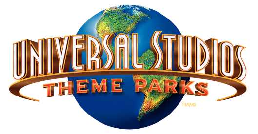
I started by looking at the logos of various amusement parks. I found a select few logos I liked and used them as inspiration for my own logo. I selected the logos of Alton Towers, Chessington WOA, Universal Studios, Drayton Manor, Paultons Park, Darien Lake, and Zippin Pippin, as my reference material as I felt they represented your typical amusement park logos from various western societies (UK, US).


Looking at these logos, these were the common themes I found:
- They're colourful and they stand out.
- The title of the park is usually followed by the words theme park, or resort.
- An image of the Earth is common within the logo.
- The colours Red, Blue, and Yellow are used often.
- The logo features a section of roller coaster track.
- The logos are quite round in shape.
- The use of 3D text is common.
Out of the logos researched, I decided to use the Zippin Pippin logo as my main reference because it belongs to a seaside amusement park. I also feel out of all the logos, it fits best with the theme I would like to go for, which is slightly lower budget, and less well known, unlike your typical amusement park.

I started by choosing a font, as I felt this would then help guide the rest of the process. After scrolling through a long list of possible fonts, I chose one called KG HAPPY.

I decided to use this font because I like the cartoony, 3D look it had. I wanted the logo for the show to look cartoony and colourful like the other amusement park logos I had researched. This logo fits in with the common themes I picked up on amongst the other logos. I also decided to use the colours Red (ff0000), Blue (5050ff), Black (000203), & White (ffffff), as my colour scheme, again because I felt like this fit my ideas of style for the show, and the style of other amusement park logos.
I opened Photoshop and typed the title of the show using this font. I moved the two words 'Pleasure' and 'Park' around a bit until I got a layout I was happy with. I then coloured the text to the shade of red I wanted, and I ended up with this.

At this point it was clear I needed to add more to this logo to make it fit the themes of the show, however it was a good starting point. I wanted it to look more animated so I added a simple black stroke to the text, which looked like this.

Next I wanted to give the text a colour box to sit in, like in the Zippin Pippin logo. I wanted the box to follow the shape and angle of the text to give it a bit more character than your average box. I added a blue box and cropped it to fit the shape of the text.

I still felt the logo needed more so I decided to give the box a stroke also to help it look more animated like the text. I added a thick white stroke, followed by a thin black stroke, like the Zippin Pippin logo.

Finally, I wanted to add a lot more depth to the logo, so I added a shadow to the box, and to the text to give it the 3D look that the other amusement park logos had. This was the final result.

I did like this logo, however I still felt it was missing something. It needed to be more round in shape, or have something behind it like an Earth or a roller coaster track. I decided to use an Earth as the background because it fits the idea that the manager of Pleasure Park believes it is the greatest place on Earth. I found an animated Earth on YouTube that I could use as a background graphic for the animated title screen later on in the project. I took a screen grab of it and added it to the logo.

Although it looked better, I still felt there was something missing from the logo, so I added a black and white stroke, and a coloured drop shadow to match the theme of the box around the text. This was the final logo.

In the end I was very happy with the final logo. I do think it is quite similar to the Zippin Pippin logo in terms of colours and the box design, however I feel this shows how I have adapted the designs of other amusement park logos to make the logo of my show look like that of a real amusement park. It is colourful, and it stands out, which will allow it to work well as a TV show logo. It will help sell the idea, and people will remember it and be interested in watching it because it is attractive.
Following on from this, I began working on a title card using the same colour scheme and design elements. I started by placing the logo on a 1920x1080 Photoshop canvas. I chose this size as it is also the size of HD video, which the show will be broadcast in.
I decided I wanted the title card to also have an animated feel like the logo design. I wanted the logo to look like it was in the sky above an animated rollercoaster. I'm not sure exactly where this idea came from, or why I liked the idea, I just wanted to try it and see what it looked like. To begin this process I added a sky blue (00aeef) background to the canvas.

Next I added a stock image of a rollercoaster silhouette to the background. I liked the idea that everything in the background would be in silhouette. This decision was mostly to draw attention to the logo, but also to continue the animated logo I was going for.

I didn't like the colour of the rollercoaster image I had chosen, so I changed to white to fit in with the colour scheme I had chosen. Finally, I added an inner shadow around the edges, and a small text at the bottom saying 'Created by Joshua Jones', something I found was common to have on a Netflix series title card.
This was the final result.
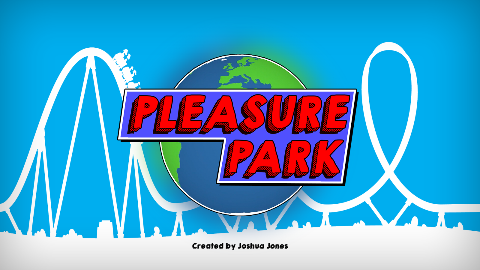
I am very happy with the final logo, and title card designs I came up with. I found that researching the logos of other amusement parks really helped me dial in exactly what it was I needed this logo to look like, in terms of colour and style. My only concern at this moment in time is that the logo looks too animated, and could fool people into thinking it is an animated show. I will consider this, and think about how I can resolve it for further designs.
I will now use this branding to create promotional material for the show.
Image Sources:
0 comments:
Post a Comment