BRANDING & MARKETING VERSION 5
These are the problems I identified with the previous versions, which I feel contribute to it looking animated:
- The blue sky doesn't look real as it is just on plain colour.
- The ground doesn't look real, it should be a texture.
- The rollercoaster needs to be a different colour so it looks more like a silhouette.
- The clouds used on the poster look too cartoony, they need to be replaced with a realistic textured cloud.
- Although the folded corner adds to the warped poster effect, it still doesn't work in the grand scheme of things.
I still want the logo to look like it is in the sky above the amusement park, but I want it too look more realistic.
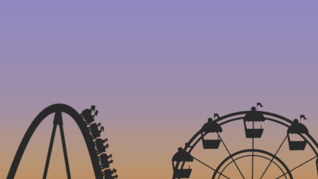
I started the process of creating a new title card with the background, which is still a colour, but a gradient like the real sky. It starts quite green/yellow, and ends quite blue. This combination of the two colours looks like the sky when the sun is setting. This gradient, with all the additional elements in the next stages, also looks more realistic than the original sky colour in the previous versions.
Next I added the silhouettes of two amusement park rides, a coaster, and a ferris wheel. I did this so it is clear we are in the sky above the amusement park. They are silhouettes because I plan to add a sun that is shining at what would be the camera, so this was cause the rides to look dark and in silhouette.
After this I added a layer of clouds, both in front of and behind the rides. These clouds are more realistic than the ones in previous versions. I also made the clouds quite grey, to add to the dark and run down look the branding needs to have. It gives the idea that the park is surrounded by grey clouds. As well as this, I added a sun setting in the corner of the screen.
I then added the logo of the show, which has not changed, to the centre of the image. I placed a slight layer of clouds over it at the bottom of the screen to give the image a slight 3D effect, as though the logo is hiding in the clouds above the park.
Finally, I added an inner shadow, grunge texture, and a faded overlay. This, when combined, made the image look old and run down, like the fiction amusement park the show is about.
This is the final version:
I am very happy with the new branding. I feel it looks more real than the previous versions which looked too animated. I also feel this new branding fits the show better than any previous versions. When you look at this version, you don't instantly assume the show is an animation/cartoon.
Using all of the elements of the new branding, I have also created new promotional material: poster, billboard, bus poster, etc...
All of the new promotional material follows the same layouts as the previous material, but with the new elements from the new branding.
Poster
Billboard
Bus Poster
Bus Stop Poster
Small Billboard
I feel all of the new branding & promotional material fits the themes and style of the show a lot better than any previous versions. This will now be the final version.


0 comments:
Post a Comment