Tuesday, 10 October 2017

Professional Pre-Production: Intial Ideas for Branding Version 1

I have chosen to focus mainly on the visual side of the pre-production process for this unit. This included coming up with a brand for the show, Pleasure Park

INITIAL IDEAS FOR BRANDING

To begin this process I started off by researching the branding of amusement parks. I want the shows branding to look like that of your typical amusement park, as the show is a mockumentary about an amusement park. I wanted the branding to feel and look real to further sell the idea that I want the audience to beleive that Pleasure Park exists.

I started by looking at the logos of various amusement parks. I found a select few logos I liked and used them as inspiration for my own logo. I selected the logos of Alton Towers, Chessington WOA, Universal Studios, Drayton Manor, Paultons Park, Darien Lake, and Zippin Pippin, as my reference material as I felt they represented your typical amusement park logos from various western societies (UK, US).


Looking at these logos, these were the common themes I found:
- They're colourful and they stand out.
- The title of the park is usually followed by the words theme park, or resort.
- An image of the Earth is common within the logo.
- The colours Red, Blue, and Yellow are used often.
- The logo features a section of roller coaster track.
- The logos are quite round in shape.
- The use of 3D text is common.

Out of the logos researched, I decided to use the Zippin Pippin logo as my main reference because it belongs to a seaside amusement park. I also feel out of all the logos, it fits best with the theme I would like to go for, which is slightly lower budget, and less well known, unlike your typical amusement park.


I started by choosing a font, as I felt this would then help guide the rest of the process. After scrolling through a long list of possible fonts, I chose one called KG HAPPY.


I decided to use this font because I like the cartoony, 3D look it had. I wanted the logo for the show to look cartoony and colourful like the other amusement park logos I had researched. This logo fits in with the common themes I picked up on amongst the other logos. I also decided to use the colours Red (ff0000), Blue (5050ff), Black (000203), & White (ffffff), as my colour scheme, again because I felt like this fit my ideas of style for the show, and the style of other amusement park logos.

I opened Photoshop and typed the title of the show using this font. I moved the two words 'Pleasure' and 'Park' around a bit until I got a layout I was happy with. I then coloured the text to the shade of red I wanted, and I ended up with this.


At this point it was clear I needed to add more to this logo to make it fit the themes of the show, however it was a good starting point. I wanted it to look more animated so I added a simple black stroke to the text, which looked like this.


Next I wanted to give the text a colour box to sit in, like in the Zippin Pippin logo. I wanted the box to follow the shape and angle of the text to give it a bit more character than your average box. I added a blue box and cropped it to fit the shape of the text.


I still felt the logo needed more so I decided to give the box a stroke also to help it look more animated like the text. I added a thick white stroke, followed by a thin black stroke, like the Zippin Pippin logo.


Finally, I wanted to add a lot more depth to the logo, so I added a shadow to the box, and to the text to give it the 3D look that the other amusement park logos had. This was the final result.


I did like this logo, however I still felt it was missing something. It needed to be more round in shape, or have something behind it like an Earth or a roller coaster track. I decided to use an Earth as the background because it fits the idea that the manager of Pleasure Park believes it is the greatest place on Earth. I found an animated Earth on YouTube that I could use as a background graphic for the animated title screen later on in the project. I took a screen grab of it and added it to the logo. 


Although it looked better, I still felt there was something missing from the logo, so I added a black and white stroke, and a coloured drop shadow to match the theme of the box around the text. This was the final logo.

In the end I was very happy with the final logo. I do think it is quite similar to the Zippin Pippin logo in terms of colours and the box design, however I feel this shows how I have adapted the designs of other amusement park logos to make the logo of my show look like that of a real amusement park. It is colourful, and it stands out, which will allow it to work well as a TV show logo. It will help sell the idea, and people will remember it and be interested in watching it because it is attractive.

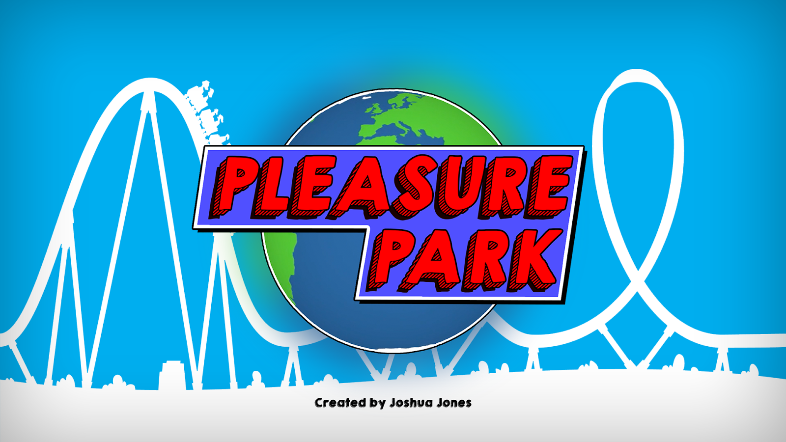
Following on from this, I began working on a title card using the same colour scheme and design elements. I started by placing the logo on a 1920x1080 Photoshop canvas. I chose this size as it is also the size of HD video, which the show will be broadcast in.

I decided I wanted the title card to also have an animated feel like the logo design. I wanted the logo to look like it was in the sky above an animated rollercoaster. I'm not sure exactly where this idea came from, or why I liked the idea, I just wanted to try it and see what it looked like. To begin this process I added a sky blue (00aeef) background to the canvas.


Next I added a stock image of a rollercoaster silhouette to the background. I liked the idea that everything in the background would be in silhouette. This decision was mostly to draw attention to the logo, but also to continue the animated logo I was going for. 


I didn't like the colour of the rollercoaster image I had chosen, so I changed to white to fit in with the colour scheme I had chosen. Finally, I added an inner shadow around the edges, and a small text at the bottom saying 'Created by Joshua Jones', something I found was common to have on a Netflix series title card.

This was the final result.

I am very happy with the final logo, and title card designs I came up with. I found that researching the logos of other amusement parks really helped me dial in exactly what it was I needed this logo to look like, in terms of colour and style. My only concern at this moment in time is that the logo looks too animated, and could fool people into thinking it is an animated show. I will consider this, and think about how I can resolve it for further designs.

I will now use this branding to create promotional material for the show.

Image Sources:

Saturday, 7 October 2017

Professional Pre-Production: Initial Episode Synopses

As part of this unit I have chosen to create short synopses for each of my six episodes to help others get an idea of what the story arc might be. These are my current synopses for the episodes, although they may change.

SERIES SYNOPSIS

Pleasure Park follows the daily lives of the staff at the Pleasure Park Amusement Park in the seaside town of Skegness, Lincolnshire. During the first series, we are a fly on the wall for some of the weirdest moments of their 2017 summer season, including an incident involving a really fat guy, and a popcorn machine that won't stop popping.

EPISODE 1- THE FIRST DAY OF SUMMER

Frank and Debbie are determined to make this summer season the best one ever for Pleasure Park by starting with a bang (literally something blows up). It's newbie Daniel's first day and he struggles to fit in until he meets Harry, who introduces him to Emily, the girl everyone has a crush on. Regular customer Reggie is at the front of the queue eager to be the first person through the gates.

EPISODE 2- THE INSPECTION

A surprise health and safety inspection causes chaos across the park as Ned tries his hardest to make sure the park passes. Sara does her best to ensure every member of staff is up to standard. Daniel tries to make a move on Emily, but Jake gets in the way, and Lucy's gossiping doesn't help. Jimmy has a meeting with Frank to discuss how Pleasure Park can be popular again.

EPISODE 3- THE BRAND NEW ADVERT

Frank and Debbie commission 'professional' filmmakers to create a brand-new advert for the park. Teachers pet Freddie does everything he can to make sure the advert is amazing for Frank, which is difficult when the two directors are awful. Popular ride op Oscar is asked to star in the advert. Sophie thinks her sister Katie is trying to steal her crush Jake, but she doesn't realise that's not the case.

EPISODE 4- THE REALLY FAT GUY

A large customer causes havoc on park because everyone is afraid to tell him he's too big to go on the rides. Instead everyone comes up with ridiculous excuses for why he can't come on their ride, and it's left for Debbie to deal with the consequences. Harry acts as a wingman to Daniel, as he tries to ask Emily out, again, but rumours about her past put him off. Reggie loses his ticket and can't get into the park.

EPISODE 5- THE MYSTERIOUS BOX

Whilst Frank and Debbie are away celebrating their anniversary, a mysteriously large box with their names on it is delivered to the park. Everyone wants to know what's inside, but Freddie won't let anyone near it. Taking advantage of Frank not being there, Jimmy makes some changes in the hope of improving the park. Sara spends all day trying to convince Ned not to quit his job, and she accidentaly admits her feelings for him.

EPISODE 6- THE AWARDS NIGHT

It's the end of the summer season and Frank and Debbie are throwing their annual Pleasure Awards. The night starts badly when a broken popcorn machine causes havoc. A series of events caused by Jake lead to Daniel and Emily being locked in a closet together, where Daniel find out the truth about her past. A nervous Sara gets drunk and kisses Ned. Jake turns down Sophie, who turns to her sister Katie for comfort. Jimmy and Oscar win most of the awards, which irritates Freddie. Lucky and Jake get their comeuppance when their prank on Harry backfires.

From this, these are the story arcs that I have decided to follow:
  • Frank is always trying to come up with ways to make the park popular again, and they always backfire.
  • Daniel has a crush on Emily from the start, but rumours put him off. By the end Emily gets an opportunity to explain herself, and the two of them kiss in the closet, leaving it open for the next series.
  • An argument over a boy brings sisters Sophie and Katie closer together.
  • Sara realises she loves Ned, something she struggles to accept, leading to a drunken kiss.
  • Lucy and Jake spend the summer ruining everyone elses days. Eventually they get what they deserve.
I've chosen these story arcs because I beleive they would keep the show interesting and make audiences want to watch each episode, something that is important when you're working on a show for Netflix where binge watching is a possibility. As I am focusing on the visual side of the pre-production, I will not be writing scripts for each episode, but I beleive these synopses provide enough information to sell the idea of the show.

Professional Pre-Production: Intial ideas for Characters

These are my initial ideas for the main characters of my hypothetical idea, Pleasure Park.

INITIAL CHARACTER IDEAS

As this show is loosely based on my experiences working in an amusement park, most of these characters are loosely based on real people, with a few exaggerations.

MAIN CHARACTERS

Frank 'Mr Pleasure' Diamond
- Frank is the boss at Pleasure Park. He has an awesome Magnum P.I. moustache.

Debbie 'Mrs Pleasure' Diamond
- Debbie is Franks wife. They've been married for 15 years, and they met during the early days of Pleasure Park when they both worked as ride operators. She is Head of Customer Service at Pleasure Park.

Sara Green
Sara (everyone pronounces it Sarah, which she hates) Green is the HR Manager at Pleasure Park. She has a weird laugh.

Ned Parker
Ned Parker is the Health and Safety Manager at Pleasure Park.

Jimmy (Jim/James) Reynolds
Jimmy is the oldest and wisest Ride Operator at Pleasure Park. He thinks he knows better than Frank.

Daniel Waterhouse
Daniel is new to Pleasure Park. This is his first season as a Ride Operator. He has a lot to learn.

Emily Roberts
Emily is that one girl everyone talks about (in a bad way), but if you get to know her you'll find out she's a nice person. Everyone has a crush on her, including newbie Daniel. She is a Ride Operator at Pleasure Park.

SIDE CHARACTERS

Katie Smith
Katie likes the colour black. Black hair, black clothes, black lipstick, she's got it all. She's a Ride Operator at Pleasure Park.

Sophie Smith
Sophie's the opposite of her sister Katie. She's a very girly girl who loves all things pink. She is two years younger than her sister. She has a crush on Jake but won't admit it because everyone hates him. She thinks she can change him. She's a Ride Operator at Pleasure Park.

Jake Evans
Jake is a bit of a bully. He's not nice to everyone because he thinks it's funny. He loves to pick on a newbie so Daniel quickly becomes his victim. He's a Ride Operator at Pleasure Park.

Oscar Wood
Oscar is a Ride Operator at Pleasure Park. He's the really cool dude everyone wants to be friends with. He has no enemies, and he loves everyone.

Harry Clarke
Harry isn't the most popular person. He's a bit of a weird guy, and it puts people off. He likes comic books and cosplay. Him and newbie Daniel become good friends right away as Danie finds it easy to talk to him. Harry is a Ride Operator at Pleasure Park.

Lucy Taylor
Lucy is a real life gossip girl. She loves to spread gossip, and it's her that starts rumours about Emily. She is a Ride Operator at Pleasure Park.

Freddie White
Freddie is a Ride Operator at Pleasure Park. He really wants to work in management but has never made it. He does everything he can to keep Frank happy, which frustrates everybody else.

REGULAR APPERANCES

'Reggie'
Nobody knows a lot about creepy old Reggie. He visits the park almost every day to see all the staff. He especially likes talking to Sophie, which she doesn't like.

ONE OFF APPREANCES

Steven & Beth
Steven & Beth are 'professional' filmmakers/advertising experts who are brought in to help create a brand-new advert for the park. Surprise, surprise, they're crap at what they do.

I have chosen to have this many characters because I wanted to represent the number of different personalities that can exist in such a unique workplace. You have a bad boss, a nervous H&S manager, a wise owl, the newbie, the hot girl, the goth, the girly girl, the popular boy, the badass, the geek, the teachers pet, and the regular customer, as well as others. These are all based on the types of people I crossed paths with during my time working in an amusement park. My next step is to work on detailed character profiles for each person, and begin casting.

Sunday, 1 October 2017

Professional Pre-Production: Final Idea: Pleasure Park

After spending some time thinking about my four initial ideas, I have decided to choose Pleasure Park as final idea for this unit.

FINAL IDEA: PLEASURE PARK


What is it?

Pleasure Park is a mockumentary series which follows the daily lives (struggles) of the staff at the Pleasure Park Amusement Park in the (fictional) seaside town of Fairwood in Cornwall. During the first series, we are a fly on the wall for some of the weirdest moments of their 2017 summer season, including an incident involving a really fat guy, and a popcorn machine that won't stop popping.

The amusement park itself is a failure, and the boss is constantly trying to come up with the next big thing to regenerate the park and bring people back to it. Some of the characters we follow include the boss, his wife, some of the ride operators, and a few regular customers.

Why a mockumentary?

I've chosen to make the series a fly on the wall style mockumentary because I want people to believe this place, and the people that work there are real. I like the idea that this style will allow the audience to go behind the scenes at an amusement park and see things that you wouldn't normally be able to see. These characters are letting cameras into their lives, and letting the audience see them at their highest and at their lowest.

Channel?

I would like to make this series for Netflix. I believe on-demand television is the future, and I believe this series will work on an online platform. Because the amusement park is supposed to be real, the fictional boss has said yes to having his own Netflix series in the hopes it will reach a lot of young people who will then want to visit the park. Netflix are making a lot great shows at the moment and I think their is a place for Pleasure Park on their service.

Focus?

I have chosen to focus on the visual side of the pre-production process. This will include working on locations, editing style, visual style, advertising/marketing, branding, opening titles and a trailer, as well as cast, crew, and episode synopses.

Episodes

I currently have six episodes planned for the first series, which is another reason why I wanted to choose Netflix as the distributor because they don't have a set number of episodes for the shows they make. These episodes are:

1. The First Day of Summer
2. The Inspection
3. The Brand-New Advert
4. The Really Fat Guy
5. The Mysterious Box
6. The Awards Night

I have ideas for the plot of each episode but I will go into detail in another blog post. I will also talk more about the characters in another post.

Why this idea?

Out of my four ideas, I felt this one had a more promising future. I don't beleive their is currently a show out there like this, set in an amusement park. I want to develop these characters and create something different that people will want to watch. I will also be able to use some of my experience working in an amusement park to fuel some of the storylines, which I hope will make some of the stories and characters seem more real.

I look forward to developing this idea during this unit.

Monday, 25 September 2017

Professional Pre-Production: Initial Ideas

I have chosen to spend the first half of my final year working on a hypothetical pre-production project. Below are my initial ideas for this project.

INITIAL IDEAS

PLEASURE PARK

Pleasure Park is a six part mockumentary series about a fictional amusement park. The series follows the daily lives of key characters within the amusement park (e.g. boss, ride & game operators, even regular customers). The amusement park itself is a failure, and the boss is constantly trying to come up with the next big thing to regenerate the park and bring people back to it. At this point in time I have ideas for two out of the six episodes. One is about the team attempting to create a new tv advertisement, and the other is about a work awards night. I'm currently planning for this show to be distributed online via Netflix, but this may change. I like the idea of doing a mockumentary series because I want people to beleive this place and these characters exist. Anyone that has been to a local amusement park will have probably met people like these characters, and thats why they be good subjects for a fake documentary.

GHOST POLICE

Ghost Police is a comedy crime drama about a pair of police officers whose sole job it is to catch paranormal criminals. I have an idea for the first episode, entitled 'PolterHeist', which is about a poltergeist who robs banks. The show would be filmed in the style of a serious Scandinavian crime drama. Each episode would be about a different crime to two literal paranormal investigators would have to solve. This would be a series for ITV 2 or BBC Three.

PARADISE ISLAND

Paradise Island is a fictional tv series about a group of celebrities filming a reality series on an island, when they are overrun by its cannibalistic inhabitants. The idea for this show came from watching a similar Channel 4 series called Dead Set, which was essentially a zombie apocalypse set inside the Big Brother House. The idea also stems from a film called Cannibal Holocaust, which is about a documentary crew that is tortured by a group of cannibals. The show would be a drama for Channel 4, using the cover of The Celebrity Island with Bear Grylls as the reality series.

EPPLE BAY

Epple Bay is a crime thriller similar to Broadchurch, but set in the real Epple Bay in Kent. It follows a team of investigators as they work to stop a serial killer who has been responsible for numerous deaths in the area. This would be for ITV 1.

Out of these four ideas, Pleasure Park is the most developed, and the one I have the most ideas for, so at this stage, it is probably the one I will work on for the rest of the project.

Sunday, 14 May 2017

Professional Practice: Project Evaluation


PROFESSIONAL PRACTICE PROJECT EVALUATION

PRE-PRODUCTION

I started this unit wanting to do a work placement with Trickbox TV as studio production is the area I would like to work in, in the future. These plans soon changed when I was chosen as the producer for the Studio Production Unit, and so I decided that doing a commission would be a more sensible idea as I would be able to put together my own schedule. Around this time a local secondary school contacted me about the possibility of producing a new film for them. I decided this would be a great comission for this unit and accepted the offer. Although I have a previous relationship with them, I would be working we knew people I hadn't met before.

I arranged an initial meeting with the school so we could discuss the film they would like me to produce. They decided they would like me to produce a teacher training film because they often get asked for advice from other schools, and they wanted something they could show them. The film's topic would be the use of questioning techniques in lessons. As this was something I knew nothing about, I arranged to speak to the teachers that would be featured, so I could learn more about their techniques. This also helped me think about the questions to ask in their interviews, and how I could go about filming their lessons. I also arranged to scout the locations for the lessons so I could look at the  health and safety, and practically of them. This helped me produce my risk assessment and helped me think more about how I could film the lessons.

I conducted some research into teacher training films by watching three of them online. There are lots of training films out there, but you have to pay for them, so the three free ones I watched probably aren't the best examples. I found that they tend to be uninteresting, and that they're often very plain, and uncreative. I knew the school would like something different, and interesting so that people actually pay attention to it. I took this information forward with me during the rest of the planning process to ensure this film was interesting and creative.

Finally, I conducted some research into shooting interviews, as I wanted the interviews in this film to look slick and professional. You can see that research here. In summary I learnt about the use of three point lighting, using the rule of thirds to frame the subjects, and sitting the subjects far from the lens to create a blurred background.

Overall the pre-production process wasn't too bad. I spent most of it researching the techniques I would be featuring by talking to the contributors. This ensured I told the correct story on screen, instead of trying to guess how it should be told.

PRODUCTION

See more about the filming days here: Filming Days

The first filming day began with a lot of setting up. I had to set up the interview location, which included dressing the set, lighting the set, and setting up the camera. I started by positioning the interviewees chair as everything would be built around it. I then lit the room using the three point lighting set up, and finally I set the camera up and used a stand in to frame the shot, and set the mics up.

During the interviews I used a preset list of questions, expanding and re-phrasing when required. This ensured I got the most out of my interviewees, and got them to tell me information they had already told me before.

To film the actuality I used a multi-camera setup. This allowed me to vary my shots sizes, and gave me a wide shot to cut to when I needed to cover up repos on my handheld camera. For the handheld camera I attached a Sony PMW to a shoulder rig, which helped to prevent strain and made it easier to keep the camera stable. For the secondary camera, I set a Canon EOS M1 up on a tripod and positioned it at the back of my locations.

I found the four filming days pretty easy. It was very similar to filming the documentary unit. Because I was prepared and always turned up early, I was ready for every challenge. I found filming the actuality to be quite a strain on my back and arms. Holding a camera up for 30-45mins was a challenge, and I think without the shoulder rig it could've been even worse.

POST-PRODUCTION

I started the post-production process off by watching the interview footage back and using timecodes to create an A/V script I could use to edit the film together. I found this made the editing process easier because I already had a transcript for the sections of the interviews I wanted to use. I also watched the actuality footage back and made notes on shots I liked and wanted to feature in the final film.

I also produced a set of branded content for the film, which included a lower third template, background image, and logo end card. I planned to use all of these in the film to give it an overall King Ethelbert School look.

Editing the film together was a long process, mostly because for each actuality sequence I was working with a multi-camera set up, which meant I had to watch through both 30-45min shots for each lesson and cut them together. Cutting the interviews together was a lot easier because I had the A/V script.

Once the assembly cut was ready, I fine tuned it, added the text and lower thirds, colour corrected it, and leveled all of the sound. Once that was complete, the rough cut was ready. My commissioners loved the rough cut and gave no negative feedback. As no changes needed to be made, I removed the timecode, and fine tuned some of the cuts, and exported the final film. I then sent it off to my commissioners along with the branded material I had produced.

OVERALL EVALUATION: CRITICAL REFLECTIONS

Strengths-

  • I beleive my main strength during this project was my general filmmaking ability. I was able to produce a good film that my commissioners loved and made no changes to. I was able to shoot nice interviews and good actuality, something I've learnt is no easy task.
  • Another strength was my organisation skills. I was able to organise the filming of 5 interviews, and the filming of 4 actuality based multi-camera sequences. In addition to this, on the filming days I filmed at least 10 more interviews with students. It took time to organise, but because I did it all early in the production, filming wasn't too difficult.
Weaknesses-

  • My main weakness was the relationship I already had my commissioners prior to this unit. Although I did not know everyone I worked with, I did know the headteacher, and the deputy headteacher, who were my main points of contact. This did make organisation a lot easier, and I feel that prevented me from getting the full experience, and coming across most of the usual challenges that come with being a freelance filmmaker.
  • I also feel I could've spent more time researching teacher training films. Although I spent time research the teachers I would be featuring, I didn't spend a lot of time research teacher training films as a whole.

Possible Developments- What did I learn?

  • I learnt that building a good rapport with your contributors and commissioners is the key to creating a successful film where everyone looks like they want to take part. This allowed me to get the best out of my contributors.
  • If I were to do this again, I would:
    • Try to get a commision from someone I didn't already have a relationship with.
    • Spend more time researching the genre I was working in.
    • Work on my techniques for shooting interviews. Although I did the correct things, the shots did not look as good as I had hoped they would.
CONCLUSION


Working on this unit overall was not too difficult. I enjoyed creating the film, and I think this camera across in the final edit. I tried my best to make the film interesting and creative, and I others will agree that it is. I also hope the school use the film for years to come, and lots of people get to see the work I have produced. I learnt a lot on this unit about interviewing and shooting actuality using a multi-camera setup, and I hope I can take all of this information forward with me, and apply it to future projects.

Saturday, 13 May 2017

Professional Practice: The Final Commission

Below is the final film I produced for King Ethelbert School as my commission: