Tuesday, 12 December 2017

Professional Pre-Production: Project Evaluation


PROFESSIONAL PRE-PRODUCTION PROJECT EVALUATION

Before I started this unit, I had four clear ideas that I needed to narrow down to one. Eventually, after much thought, I narrowed it down to Pleasure Park, a comedy set in a fictional and failing seaside amusement park.

My initial plans for Pleasure Park were that it would be a mockumentary series broadcast on Netflix, however it soon became clear that my story choices, location choices, and casting choices were not going to allow for that, and so the show became a comedy series broadcast on Sky One.

Throughout this project I attempted to develop my storylines and character developments as much as possible, and in the end, I feel what I produced was not bad, but it probably wasn’t the best it could be. I had to greatly reduce my character numbers because there were too many that just didn’t fit in, and looking back, I can think of at least two more characters that also could’ve been scrapped.

I was mainly focusing on the visual side of the project, and I feel my branding, marketing, and title sequence were of a good standard, however I feel I could’ve done more work on my visual style and editing style. I also feel I could’ve completed more contextual research.

I chose to present my work in the form of a website, and I feel the final website I produced was of a good standard. It is easy to navigate, and all of the information is presented clearly. The website follows the same themes and styles set out by the shows branding, which shows a consistency across the project.

OVERALL EVALUATION: CRITICAL REFLECTIONS

Strengths-

·      After narrowing it down, I came into this unit with one clear idea. I completed a lot of elements of the graphic design side of the project during the summer period, which meant that when it came to September, I was in a good place, and had enough time to start making changes. I feel this helped me keep on track.
·      During the Digital News until I picked up a lot of skills, one of which was using the Wix Website Creator, which came in handy on this unit. As I had decided to present my work in the form of a website, it was good to know that I had experience with the platform already. This meant I was able to put an initial website design together quickly at the start of the project, which ultimately didn’t change to much throughout. Like the previous point, I feel this helped me keep on track.
·      Another strength that I feel aided me in this project is my graphic designs skills. As my role was a Concept Producer, I had to complete a lot of tasks which involved manipulating imagery in some way. My experience using the Adobe Creative Suite, helped on all aspects of this unit, and I feel the final pieces I have produced demonstrate this.

Weaknesses-

·      Character Development was a weakness for me. At first, and possibly even still, my characters were not as developed as they could be, and seemed to be mostly based on stereotypes. Most of my characters are based on real people I know, but I had to ensure they weren’t too obvious. I feel because I had to do that, I had to make things up for some characters, which ultimately meant that some of them didn’t appear to develop much. It was mentioned that my female characters especially needed work. I feel my lack of good character development may let me down on this unit.
·      I am not a very good writer. This was a problem on this unit, as I had to create synopses for every episode. I struggled initially as there wasn’t a clear story arc. I feel in the end my synopses were not awful, but they could probably be better, if my writing abilities were better. I need to improve on this.
·      Organisation was a struggle at times. I feel because I started this unit a little bit ahead of where I should’ve been, I let this sway me into thinking I could leave the project alone for a few weeks. Ultimately this lead to a lot of last minute decisions that could spoil the rest of the project. I am normally organised, but a lack of good motivation affected me on this project.
·      I need to improve on accepting feedback from others. I’ve never been very good at it. Once I have created something, I seem to feel there is nothing that can be done to improve it. However, on this unit, once I did eventually start to follow feedback, I found the project was greatly improved, and so I wish I had listened earlier.

Possible Developments- What did I learn?

·      You’re not always right first time. Feedback, whether it be positive or negative, is a good thing, and should be listened to, not ignored.
·      If I were to do this again, I would:
o   Listen more.
o   Be more organised and not let last minute decisions spoil my work
o   Work on the writing side of the project more to ensure it is the best it can be
o   Think more about character development, as it is an important part of any visual piece.

CONCLUSION

Working on this project solo has taught me a lot about myself and the way I work when I not being motivated by others. It would appear that I just stop working, and leave certain things that look too difficult until last minute, which ultimately means they’re not any good. I have also continued to learn that I am not very good at accepting feedback from others, something I definitely need to work on and improve on before the next unit starts. And finally, I have learnt that writing is definitely not for me.


Overall, I am very happy with the final pre-production package I produced. I really like my idea, and I am very pleased with all of the changes that have been made to it since the initial stages. In the end, I feel I produced something that would have a chance in today’s marketing, and would have an audience on my chosen broadcaster. In my opinion, Pleasure Park is unique and I hope there is a good future for it.

Professional Pre-Production: Website

On this project I have chosen to present my work in the form of a website.

WEBSITE

I have chosen the website option for the following reasons:

- It's easy to adapt, even at the last minute. If I had chosen to create a book, everything would be set in stone when I sent it off to the printers. I'd prefer to be able to make changes when ever I need to, even if it's the same day as the deadline.
- I want people to beleive Pleasure Park could be a real place, so by designing the website to look like the website for the actual park, not the show, I can hopefully achieve this.
- I feel I have more creative opportunity on a website. Wix has a very easy to use platform that pretty much allows you to create a website that looks, feels, and does whatever you like. I feel with a book I would've been more limited to what I could create. On a website I can add visual moving material which is important when I am focusing on the visual side of the project.

The first thing I did was look at what I needed to and was going to research and create for this unit. I then used this information to create my website pages, which are:

- Home page
- About page
- Episodes
- Cast
- Crew
- Broadcaster
- Branding
- Marketing
- Style
- Location
- Opening Titles

I have been updating these pages throughout the project, and below are examples of the final versions.

The entire website follows the themes, styles, colours, fonts, and graphics, that have been set out by the show's brand. Everything is on brand, and blends together well.

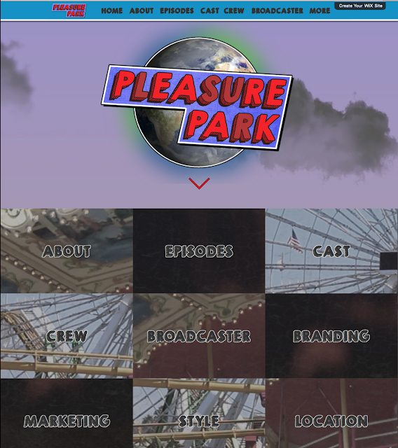
HOME PAGE

The home page is the first page to come up. It features:

- The logo sitting in front on an animated sky background to simulate the look of the opening titles.
- Links to all of the other pages for ease of access.


ABOUT PAGE

The about page tells the audience more about the show and features:

- Information on the format of the show
- Information on the series synopsis
- A link to the episode sysnopses


EPISODES

The episodes page tells the audience a little bit more about the story arcs across the series. It features:

- Story arcs across the series
- Links to the full synopses for each episodes


Each episode page features:

- A synopsis (as seen on the sky guide)
- Details of the main plotline/obstacle
- A list of key events from the episode selected


CAST

The cast page tells the audience more about the cast and characters. It features:

- Links to each cast members/characters details


Each character page features:

- A small poster advertising the character and who plays them.
- Details on the actor/actress, including agent details
- Information on why that person was chosen
- A detailed character profile


CREW

The crew page tells the audience more about the crew chosen to work on the show. It features:

- A list of links to each crew member's individual page.


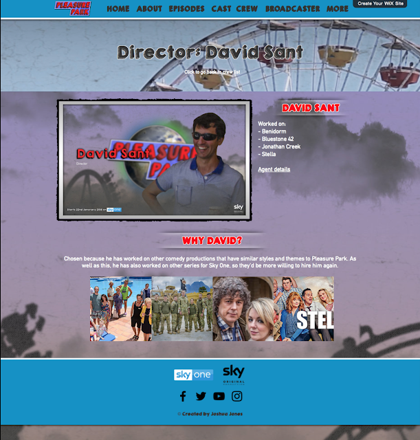
Each crew members page features:

- A small poster advertising the crew member
- Details on what the crew member has worked on
- Agent details
- A reason why that crew member was chosen
- Images from the projects they've worked on


BROADCASTER

The broadcaster page tells the audience more about the broadcaster. It features:

- A short description of the broadcaster and their content
- Information on the broadcasters audience
- A reason as to why the broadcaster was chosen


BRANDING

The branding page tells the audience about the show's branding. It features:

- Information on the logo, and the reasons behind its design
- Information on the title card and why it was created
- Information about the fonts used and why
- Codes for the colour scheme of the shows branding


MARKETING

The marketing page tells the audience more about how the show will be promoted. It features:

- Poster designs
- Billboard designs
- Bus poster designs
- Sky guide promotion designs
- The reasons behind each design


STYLE

The style page lays out the visual and editing style of Pleasure Park. It features:

- Information on themes, framing, shot types, and lighting
- Information on editing techniques, cut types, and colour grading


LOCATION

The location page tells the audience about the chosen location for the show. It features:

- Reasons why this location was chosen
- An image of the location


OPENING TITLES

The opening titles page shows the audience the opening titles design. It features:

- Background information the the design
- The final title sequence


Overall I am very happy with the final website design. I feel it matches the brand of the show and actually represents it. I also feel it is a good way to display all of the information, and I feel my chosen layout contributes to this.

To view the final website, go to:

https://pleasurepark.wixsite.com/home


Monday, 11 December 2017

Professional Pre-Production: Title Card & Title Sequence Developments

As part of my role in this project, I have to create a title sequence for Pleasure Park. This will be made of two parts, the sequence, and the animated title card. As the branding for the show has been developing, so have the title cards, and sequences. Below I have detailed their development up to the current version.

TITLE CARD & TITLE SEQUENCE VERSION 1

My initial idea for the animated title card was that it would look like the logo was in the sky above an amusement park, so it would match the branding I had already created. I decided to go with this idea.

My initial idea for the title sequence was that it would look like a series of postcards featuring images of Pleasure Park. I thought this went well with the whole idea that Pleasure Park is a seaside amusement park, and I felt postcards were the sort of thing that would represent this idea well.

I started by creating the animated title card, and I did this using After Effects. In a new composition I added all of the layers from the title card photoshop file, minus the rollercoaster and Earth, as I had already animated these in a separate composition. I then added the rollercoaster and Earth to the composition.

Finally I added a small transition to the Earth and logo so they would zoom onto the screen. The rest of the composition didn't require any animation.

Next I created the sequence. I also did that in After Effects. I created a series of postcard style images in Photoshop using photos from the amusement park I work at. I then added them to the composition, and animated them to look like they were being piled on top of each other, like someone was placing them down onto a surface, or like they were dropping into a postbox. And finally, I added the text layers which I animated so they'd move slightly, making them more interesting.

To complete the entire first version, I merged the title card, and title sequence together, and this was the final result:


At the time I really liked this first version, but looking back on it I can see it needed a lot of improvement. Feedback was mostly that it looked to animated, but also that it looked to clean to represent a fictional place that is failing.

I took this information on board to create the second version.

TITLE CARD VERSION 2

Version 2 needed to look more dirty and distorted. To achieve this I did these things:

- Animated the corner of the image to fold over like an old poster peeling off of its surface.
- Animated the rollercoaster so it looked like it was crashing off screen, insinuating the failing amusement park can't operate it properly.
- Animated the logo to drop out of position slightly to look like it was an old sign that was falling off its hinges.
- Animated some of the letters on the logo to fade out so they look like lights that don't work properly.
- Added a grunge layer over the entire composition to make it look dirty and old.

All of these changes I feel achieved the look I was going for. I decided to drop the title sequence from the first version as I felt it didn't really work. I will continue thinking about what I want that to be.

This was version 2:


Feedback was that this still wasn't quite there. It needed more to make it look older and dirtier, and it still looked too animated. 

TITLE CARD & TITLE SEQUENCE VERSION 3

For version 3, I wanted to continue making it more old and dirty looking, and less animated.

I feel I achieved this:

- By replacing the animated Earth with one that looked more realistic.
- By replacing the background with a blue crinkled paper texture.
- Adding a metal texture to the logo to make it look more like a sign.

As well as this I created a new title sequence. My idea for this was that it would be made up of footage from an amusement park with funky transitions between each shot. I thought this would look good and it followed the conventions of some other TV show titles I had seen (e.g. The Office UK). I edited all of the footage together in Premiere Pro, and I added a slightly animated look to the footage so it would match the title card more.

This was version 3:


Feedback was that again it still looks to animated, and there is still something that isn't quite right about it. I will review my progress, and think more about what I can do next.

TITLE CARD VERSION 4

For version 4 I decided to drop the title sequence from version 3. I wasn't too keen on it, and it really wasn't working.

To continue the development of this version I only made one change which involved adding a metal texture to the background in an attempt to make it look more real and less animated.

This was version 4:


Overall feedback was that it still didn't work. I needed to think of something completely different if I was going to make this work.

TITLE CARD & TITLE SEQUENCE VERSION 5

To create version 5, I completely scrapped the original versions. I still wanted the title card to look like the logo was in the sky above an amusement park.

I used all of the layers from the Photoshop file for the 5th version of the branding to create a composition in After Effects, minus the Earth, rollercoaster, and ferris wheel, which I animated in a separate composition.

I animated the logo in the same way as in the previous versions so it would still look like a broken sign. I also animated the clouds in the sky so they would move slightly like real clouds.

All of that was done in an attempt to make it look more realistic and less animated.

As well as this, I also created a new title sequence. The initial idea was that the camera would move through an amusement park before moving up into the sky to reveal the logo. I decided to create all of it in After Effects instead of filming it as this would give me a bit more creative freedom and room for movement if I want to change anything.

I created a series of animated amusement park related compositions (rides, games etc) and put them into a scene in After Effects. I needed added a camera to the composition and created 5 separate shots that were each accompanied by a block of credits.

To accompany this I also found a music track to act as the theme music. The music I chose is from another TV series called Porters, and it was composed by the composer I have chosen for my show. I chose it because I felt it sounded like the sort of music that would work if this were a real production. It has an amusement park feel, mostly because of the organ featured which reminds me of Blackpool.

This was the final result for version 5. The first few seconds are blank to represent where the pre-titles scene would go, and how the theme music would mix into it.


Feedback was that it was good, and the animation wasn't bad, but there was still some improvements that could be made. It was suggested that maybe the rides and games could not work properly, which fits the theme that the park is old and falling into disrepair. I liked this idea so I took it on board to create version 6, the final version.

TITLE CARD & TITLE SEQUENCE VERSION 6

To create version 6 I took on board the feedback mentioned. I re-animated all of my ride and games compositions to make them break down in some way:

- The spinning ride falls off its supports
- The strength test flies into the air and the sign brakes
- The duck game is on fire, and one of the ducks stops
- The sign on the ticket booth breaks off on one side and the lights stop working
- The rocket falls off its support and hits the ground

To improve this version more, I also added a collection of sound effects to add to the realism of the sequence.

This is the final opening title sequence for Pleasure Park:

Wednesday, 6 December 2017

Professional Pre-Production: Crew

As part of this process, as well as casting, I must also choose a crew. I will not be choosing an entire crew as that would be impossible and pointless, instead I will be choosing a Director, Cinematographer, Editor, Production Designer, and a Composer.

CREW

Director: David Sant
Worked on:
- Benidorm
- Bluestone 42
- Jonathan Creek
- Stella

Chosen because he has worked on other comedy productions that have similar styles and themes to Pleasure Park. As well as this, he has also worked on other series for Sky One, so they'd be more willing to hire him again.


Agent: https://www.independenttalent.com/directors/david-sant/


Editor: Nick Ames
Worked on:
- Benidorm
- Plebs
- Red Dwarf
- Death in Paradise


Chosen because he has worked on productions that have a similar editing style to Pleasure Park. As well as this, he has worked on other shows with my chosen director.


Agent: http://www.jessicacarneyassociates.co.uk/clients/technicians/nick-ames/


Rob Kitzmann: Cinematographer
Worked on:
- Episodes
- Plebs
- Outnumbered
- Him & Her


Chosen because he has worked on other shows that have a similar visual style to Pleasure Park. As well as this, he has worked with my chosen editor, production designer, and composer before on other productions.


Agent: http://robkitzmann.com/


Julian Fullalove: Production Designer
Worked on:
- Upstart Crow
- Trollied
- Red Dwarf
- Plebs


Chosen because he has worked on other shows that have a similar production design to Pleasure Park. He has also worked on other workplace comedies, one of which was for Sky One, so they'd be willing to hire him again for another production. He has also worked with my chosen editor, cinematographer, and composer before.


Agent: http://www.julianfullalove.com/


Oli Julian: Composer

Worked on:
- Plebs
- Episodes
- Josh
- Catastrophe


Chosen because produced soundtracks which sound similar to the types of soundtracks I would like for Pleasure Park. As well as this, he has worked with my chosen editor, cinematographer, and production designer on previous productions.


Agent: http://www.mannersmcdade.co.uk/composer/oli-julian/


Most of my crew choices have worked together at least once on another show, which I feel would help if they had to work on this show together too. They already have good work relationships.

I have chosen this crew because of the shows they have worked on in the past. I have watched clips from the shows they worked on to better understand their styles, and I feel they all fit with what I have planned for Pleasure Park. They have all worked in the comedy genre, so they should feel fine doing it again for Pleasure Park.

Professional Pre-Production: Final Location Choice

Location choice is very important for this show. It is set in a fictional and failing amusement park, which meant I had to find an amusement park that was open, full of rides, but doesn't look too good to be a failing one. This ruled out most of my original choices, but did leave me with one good choice left.

FINAL LOCATION CHOICE: PLEASURE BEACH, SKEGNESS
Botton's Pleasure Beach is a family amusement park in Skegness. It is home to 24 rides, 4 of which are roller coasters.

I beleive Pleasure Beach is a perfect location choice for Pleasure Park because:

- It's right next to the beach
- It's situated in a town that could work as a failing seaside town.
- Has a good number of rides, which is good for background in scenes.
- It looks a lot like how I imagine Pleasure Park would look if it were a real amusement park.
- Compared to all of my other choices, this one works the best for the show.

By using a real location, it will most likely work out a lot cheaper than building a fake amusement park for filming purposes. Most scenes in the show will take place in the park.

If the show were real, it would've filmed during the springtime of 2017 when Pleasure Beach is closed to the public. According to their website, the park is open from May-September, so the show would be filmed outside of those times to avoid disruption. This would also then leave enough time for the show to be put together in time for it's January 2018 launch.

Professional Pre-Production: Final Episode Synopses

Throughout this process I have been developing my episode synopses for Pleasure Park. These are the final synopses for each episode.

FINAL EPISODE SYNOPSES

Episode 1- The First Day of Summer

Synopsis (as seen on Sky Guide): It’s the first day of summer at the Pleasure Park Amusement Park, but a warning of closure from the local council threatens to ruin team moral.

Main plotline/obstacle: Frank and Debbie receive a letter telling them the council want to close the park for redevelopment. They call a meeting to tell all the staff, but they struggle to tell everyone because they don’t want to lower the team moral on the opening day.

Key events in this episode:
-      Frank and Debbie receive a letter telling them the local council want to close the park and redevelop the land as a brand-new, state of the art shopping centre. The council hopes this will bring more people to Fairwood, which is a fictional seaside town in Lincolnshire.
-      Newbie Daniel starts his first day as a ride operator at the park. He struggles to fit in until he meets Harry, who introduces him to Emily. For Daniel, it feels like love at first sight, even though he doesn’t know anything about her. Emily’s best friend Katie can tell straight away that Dan likes her, and she teases Emily with this information, but Emily doesn’t bite.
-      Regular customer Reggie is at the front of the non-existent queue eager to be the first person through the gates, but he can’t find his tickets.
-      The opening day doesn’t go smoothly when, after a team briefing about the letter they’ve received, Frank and Debbie accidently lower team morale.

Episode 2- The Inspection

Synopsis (as seen on Sky Guide): Ned is tested when a surprise health and safety inspections threatens to close the park forever. Daniel tries to make a move on Emily, but Jake gets in the way.

Main plotline/obstacle: A surprise health and safety inspection puts the future of the park in jeopardy when Ned struggles to get the park a pass rating. A failure could give the council a good reason to close the park immediately.

Key events in this episode:
-      A surprise health and safety inspection causes chaos across the park as Ned tries his hardest to make sure the park passes. A failure could give the council a good reason to instantly close the park. Most of the staff don’t care about health and safety, but after a few near misses, the park passes the inspection, much to Ned’s relief.
-      Frank enlist the help of Jimmy, and the two of them visit the council offices to try and convince them to keep the park open. Frank and Jimmy contradict each other throughout the meeting, which only confuses the councillors more.
-      Daniel decides to make a move on Emily and ask her out, but bully Jake gets in the way. He tips a mop bucket of dirty water all over Daniel seconds before he approaches Emily. Emily laughs, but her friend Katie, who feels bad for Daniel slaps Jake in the face and warns him to back off.

Episode 3- The Brand-New Advert

Synopsis (as seen on Sky Guide): In a last chance bid to make the park popular again, Frank hires two internet celebrities to create a new advert for the park, but will it work out the way he had hoped?

Main plotline/obstacle: Frank and Debbie hire YouTube stars Alfie Deyes and Zoe Sugg to create an advert for the park, in the hopes that they’re younger appeal, and millions of followers, will make the park popular again. However, it turns out their ideas for the advert are a bit bonkers, a fact all the staff struggle to cope with.

Key events in this episode:
-      Frank and Debbie hire two YouTube stars to create a brand-new advert for the park in the hopes that it will make the park popular again, and help keep it open. The two stars they hire, Alfie Deyes and Zoe Sugg, end up coming up with some crazy ideas that most follow online trends, like making Frank do the cinnamon challenge. Jimmy is left in charge of looking after the stars, which he struggles with because they’re young vocabulary is difficult for him to understand. The advert flops.
-      Daniel is asked to star in the advert by Zoe, which brings him to the attention of the whole park, including Emily, when he’s made to do the Ghost Pepper challenge. This involves eating a very hot pepper. Daniel runs around the park trying to find anything that can reduce the heat in his mouth. He is eventually given a large milkshake from Emily, well he steals if from her actually. This ends up being the first time they talk properly.

Episode 4- The Really Famous Guy

Synopsis (as seen on Sky Guide): Debbie tries her best to keep the park’s famous visitor happy, which she finds difficult when nobody else knows who he is. Daniel tries his luck with Emily again.

Main plotline/obstacle: A really famous guy visits the park to have a fun family day out whilst filming a TV show in the area. Debbie is left in charge of keeping him happy as a good review from him could keep the park open. Unfortunately, he ends up having an awful day because nobody seems to know who he is.

Key events in this episode:
-      Debbie is left in charge of looking after a really famous guy when he visits the park. She hopes that if he has a good day, he will give the park a positive review on social media. Unfortunately, he ends up having a terrible day. Most of the staff ignore him, or treat him like crap because they don’t know who he is. They treat him like they treat every customer, badly. Turns out he was in a TV advert for underpants in the 70s, and only Debbie remembers him.
-      Reggie is on park, and he definitely knows who the really famous guy is. He won’t leave the guy alone, which only adds to the awful day the guy is already having.
-      Daniel tries one final time to ask Emily out, this time using Harry as his wing man. Harry talks to Emily and tries to sell Daniel too her, but he’s creepy demeanour scares her off.

Episode 5- The Good Old Days

Synopsis (as seen on Sky Guide): Frank’s old-fashioned values threaten the future of the park when he makes a few changes whilst Frank and Debbie are away.

Main plotline/obstacle: Whilst Frank and Debbie are away at a meeting, Jimmy decides to make some changes to the park in the hopes that it’ll take the park back to what he calls ‘The Good Old Days’. Unfortunately, the good old days aren’t that good anymore, and the general public are put off by Jimmy’s old-fashioned values.

Key events in this episode:
-      Frank and Debbie visit the council offices to discuss the future of Pleasure Park. Although this is happening, it is not featured in the episode.
-      Whilst Frank and Debbie are away, Jimmy makes some changes in the hope that they will improve the park, and take it back to what he calls ‘the good old days’. Unfortunately, his old-fashioned views irritate, upset, and scare off most of the customers. It’s at this point that Jimmy finally realises that maybe Frank has been doing the right thing all along.
-      Ned begins to think he has no future at Pleasure Park, so he applies for a job elsewhere. He spends the whole day trying to find somewhere private to have his skype interview. Every time he finds somewhere, he’s interrupted.
-      Daniel decides to give up trying to ask Emily out. Every time he tries, he fails.

Episode 6- The Awards Night

Synopsis (as seen on Sky Guide): Frank and Debbie throw their annual Pleasure Awards, and the future of the park is finally revealed.

Main plotline/obstacle: It’s judgement day for the park, but Frank and Debbie continue as normal and throw their annual Pleasure Awards for their staff. The council crash the ceremony to deliver a verdict on the future of the park (like they’re announcing the winner of an award e.g. gold envelope etc). Just before the result is revealed, Frank receives a phone call from an unknown person who has seen the new TV ad and wants to invest money in the park. This will keep the park open for the next year, but will Frank accept the offer with the unusual T&Cs? (similar to Bad Education episode)

Key events in this episode:
-      It’s the end of the summer season, and despite the fact that the future of the park hangs in the balance, Frank and Debbie continue as normal and throw their annual Pleasure Awards.
-      A series of events caused by Jake trying to get his own back, lead to Daniel and Emily being left at the top of the Giant Wheel, where they get to have a good chat, and eventually, with alcohol as an influence, a good kiss too.
-      Katie finds out what Jake has done and gives him a good kick between the legs before getting Daniel and Emily down from the Giant Wheel, interrupting their drunken kiss.
-      Ned wins a special award for being an unsung hero. This makes him emotional, and once he’s alone, he calls the people that interviewed him for a new job, and tells them he no longer wants it.

-    The local council crash the ceremony to deliver their verdict. As they’re about to do so, Frank receives a call from an unknown caller who offers him a huge investment in the park. There is however a catch, he will have to leave his post as manager and hand that role over to the investor. This will ensure the park stays open, but will Frank accept the offer?

These synopses allow for good story arcs across the series. These arcs are:
- Frank and the team try their best to stop the park from being closed for redevelopment.
- Daniel has a crush on Emily, but keeps trying and failing to ask her out.
- Jimmy thinks he knows better than Frank but soon realises he may be mistaken.
- Reggie continues to visit the park every day.
- The terrible new advert for the park, ends up possibly saving it from closure.
- Ned goes through a 'rollercoaster' of emotions trying to decide whether he should stay at the park or not.

I feel these arcs will allow for a good series, with enough stories left for it to continue beyond one series. They also allow for good character development, and they are interesting and funny.