On this project I have chosen to present my work in the form of a website.
WEBSITE
I have chosen the website option for the following reasons:
- It's easy to adapt, even at the last minute. If I had chosen to create a book, everything would be set in stone when I sent it off to the printers. I'd prefer to be able to make changes when ever I need to, even if it's the same day as the deadline.
- I want people to beleive Pleasure Park could be a real place, so by designing the website to look like the website for the actual park, not the show, I can hopefully achieve this.
- I feel I have more creative opportunity on a website. Wix has a very easy to use platform that pretty much allows you to create a website that looks, feels, and does whatever you like. I feel with a book I would've been more limited to what I could create. On a website I can add visual moving material which is important when I am focusing on the visual side of the project.
The first thing I did was look at what I needed to and was going to research and create for this unit. I then used this information to create my website pages, which are:
- Home page
- About page
- Episodes
- Cast
- Crew
- Broadcaster
- Branding
- Marketing
- Style
- Location
- Opening Titles
I have been updating these pages throughout the project, and below are examples of the final versions.
The entire website follows the themes, styles, colours, fonts, and graphics, that have been set out by the show's brand. Everything is on brand, and blends together well.
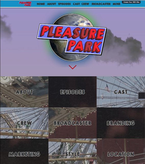
HOME PAGE
The home page is the first page to come up. It features:
- The logo sitting in front on an animated sky background to simulate the look of the opening titles.
- Links to all of the other pages for ease of access.
ABOUT PAGE
The about page tells the audience more about the show and features:
- Information on the format of the show
- Information on the series synopsis
- A link to the episode sysnopses
EPISODES
The episodes page tells the audience a little bit more about the story arcs across the series. It features:
- Story arcs across the series
- Links to the full synopses for each episodes
Each episode page features:
- A synopsis (as seen on the sky guide)
- Details of the main plotline/obstacle
- A list of key events from the episode selected
CAST
The cast page tells the audience more about the cast and characters. It features:
- Links to each cast members/characters details
Each character page features:
- A small poster advertising the character and who plays them.
- Details on the actor/actress, including agent details
- Information on why that person was chosen
- A detailed character profile
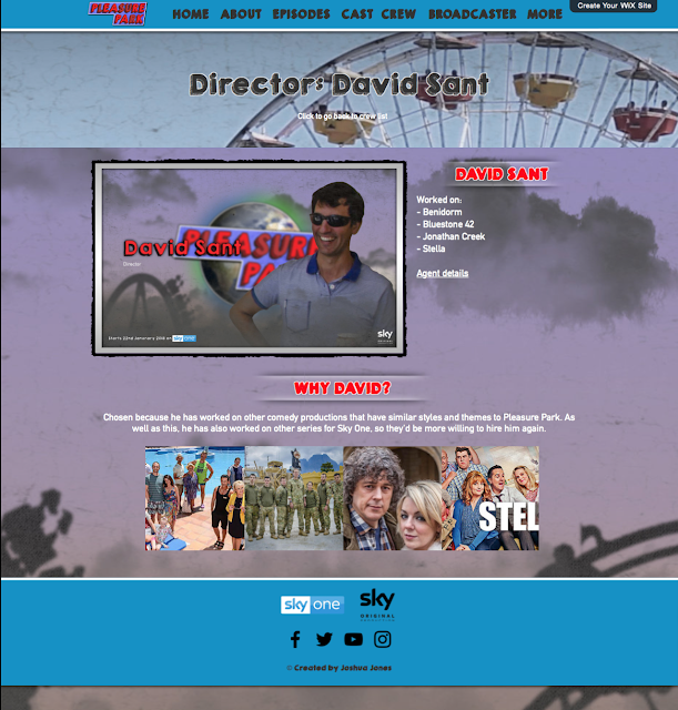
Each crew members page features:
- A small poster advertising the crew member
- Details on what the crew member has worked on
- Agent details
- A reason why that crew member was chosen
- Images from the projects they've worked on
BROADCASTER
The broadcaster page tells the audience more about the broadcaster. It features:
- A short description of the broadcaster and their content
- Information on the broadcasters audience
- A reason as to why the broadcaster was chosen
BRANDING
The branding page tells the audience about the show's branding. It features:
- Information on the logo, and the reasons behind its design
- Information on the title card and why it was created
- Information about the fonts used and why
- Codes for the colour scheme of the shows branding
MARKETING
The marketing page tells the audience more about how the show will be promoted. It features:
- Poster designs
- Billboard designs
- Bus poster designs
- Sky guide promotion designs
- The reasons behind each design
STYLE
The style page lays out the visual and editing style of Pleasure Park. It features:
- Information on themes, framing, shot types, and lighting
- Information on editing techniques, cut types, and colour grading
LOCATION
The location page tells the audience about the chosen location for the show. It features:
- Reasons why this location was chosen
- An image of the location
OPENING TITLES
The opening titles page shows the audience the opening titles design. It features:
- Background information the the design
- The final title sequence
WEBSITE
I have chosen the website option for the following reasons:
- It's easy to adapt, even at the last minute. If I had chosen to create a book, everything would be set in stone when I sent it off to the printers. I'd prefer to be able to make changes when ever I need to, even if it's the same day as the deadline.
- I want people to beleive Pleasure Park could be a real place, so by designing the website to look like the website for the actual park, not the show, I can hopefully achieve this.
- I feel I have more creative opportunity on a website. Wix has a very easy to use platform that pretty much allows you to create a website that looks, feels, and does whatever you like. I feel with a book I would've been more limited to what I could create. On a website I can add visual moving material which is important when I am focusing on the visual side of the project.
The first thing I did was look at what I needed to and was going to research and create for this unit. I then used this information to create my website pages, which are:
- Home page
- About page
- Episodes
- Cast
- Crew
- Broadcaster
- Branding
- Marketing
- Style
- Location
- Opening Titles
I have been updating these pages throughout the project, and below are examples of the final versions.
The entire website follows the themes, styles, colours, fonts, and graphics, that have been set out by the show's brand. Everything is on brand, and blends together well.
HOME PAGE
The home page is the first page to come up. It features:
- The logo sitting in front on an animated sky background to simulate the look of the opening titles.
- Links to all of the other pages for ease of access.
ABOUT PAGE
The about page tells the audience more about the show and features:
- Information on the format of the show
- Information on the series synopsis
- A link to the episode sysnopses
EPISODES
The episodes page tells the audience a little bit more about the story arcs across the series. It features:
- Story arcs across the series
- Links to the full synopses for each episodes
Each episode page features:
- A synopsis (as seen on the sky guide)
- Details of the main plotline/obstacle
- A list of key events from the episode selected
CAST
The cast page tells the audience more about the cast and characters. It features:
- Links to each cast members/characters details
Each character page features:
- A small poster advertising the character and who plays them.
- Details on the actor/actress, including agent details
- Information on why that person was chosen
- A detailed character profile
CREW
The crew page tells the audience more about the crew chosen to work on the show. It features:
- A list of links to each crew member's individual page.
Each crew members page features:
- A small poster advertising the crew member
- Details on what the crew member has worked on
- Agent details
- A reason why that crew member was chosen
- Images from the projects they've worked on
The broadcaster page tells the audience more about the broadcaster. It features:
- A short description of the broadcaster and their content
- Information on the broadcasters audience
- A reason as to why the broadcaster was chosen
BRANDING
The branding page tells the audience about the show's branding. It features:
- Information on the logo, and the reasons behind its design
- Information on the title card and why it was created
- Information about the fonts used and why
- Codes for the colour scheme of the shows branding
MARKETING
The marketing page tells the audience more about how the show will be promoted. It features:
- Poster designs
- Billboard designs
- Bus poster designs
- Sky guide promotion designs
- The reasons behind each design
STYLE
The style page lays out the visual and editing style of Pleasure Park. It features:
- Information on themes, framing, shot types, and lighting
- Information on editing techniques, cut types, and colour grading
LOCATION
The location page tells the audience about the chosen location for the show. It features:
- Reasons why this location was chosen
- An image of the location
OPENING TITLES
The opening titles page shows the audience the opening titles design. It features:
- Background information the the design
- The final title sequence
Overall I am very happy with the final website design. I feel it matches the brand of the show and actually represents it. I also feel it is a good way to display all of the information, and I feel my chosen layout contributes to this.
To view the final website, go to:


0 comments:
Post a Comment